Adding Axes to a Diagram
You can add additional axes (X, Y, and Z for Grid calculations) to a plot to compare two or more variables at the same time.
- To add an axis setting section, click the
 Add an axis button.
 - Once a new axis settings section is added, click
 Remove this axis button to delete it.
 - Wherever you see these plus or minus buttons, click to add or remove a section then define the axis as needed.
The following is based on example PM_G_03_Driving_force_and_Interfacial_energy.tcu.
How to Add and Define an Axis Settings Section
- Open example PM_G_03. The example is the Property Models → General folder.
- In the Project window right-click the Equilibrium Calculator node and add a Plot Renderer node from the Create New Successor menu. This is added to the existing tree so you can compare to the renamed Equilibrium: Phase fractions vs T node.
- Click the new Plot Renderer node. The Configuration window is where you define the plot. Available settings are based on, for example, the database selected on the System Definer and calculation type selected on the Calculator node, in this example the Equilibrium Calculator.
- For the purpose of this example, keep the default Flexible Mode as the Plot type. You can still switch between this and the Grouped Mode to see the differences.
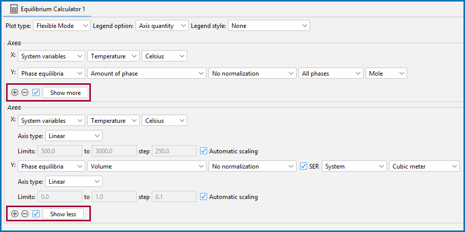
- In the Axes sections for each X and Y axis [and when relevant, Z], choose and define the variables:
- From the first list for each axis, select a variable group (i.e. All variables, System variables, Physical properties, etc.). In this example, System variables (X axis) and Phase equilibria (Y axis) are the defaults selected.
- From the second list, choose the axis variables, i.e. Temperature (X), and Amount of phase (Y).
- Based on the variable selected, from the additional lists displayed, choose the unit, i.e. for Temperature (X), select Celsius. For Amount of phase (Y), select No normalization, keep the default All phases, and select Mole as the unit. Any other relevant settings are associated specifically to the variable chosen.
- To add additional axes, click the
 Add an axis button. A new Axes settings group is added. Continue to add and define the variables to plot.
 - Keep the default X axis settings, which are the same as in the first group.
- Define the Y axis. Choose the Phase equilibria group and then the variable Volume. Keep all the defaults.
You can toggle between Show more and Show less to discover and define additional settings i.e. choose an Axis type, set Limits, adjust the scaling and much more. In this example, no changes are needed. You might also need to expand the Configuration window to the right if you cannot see all the settings.
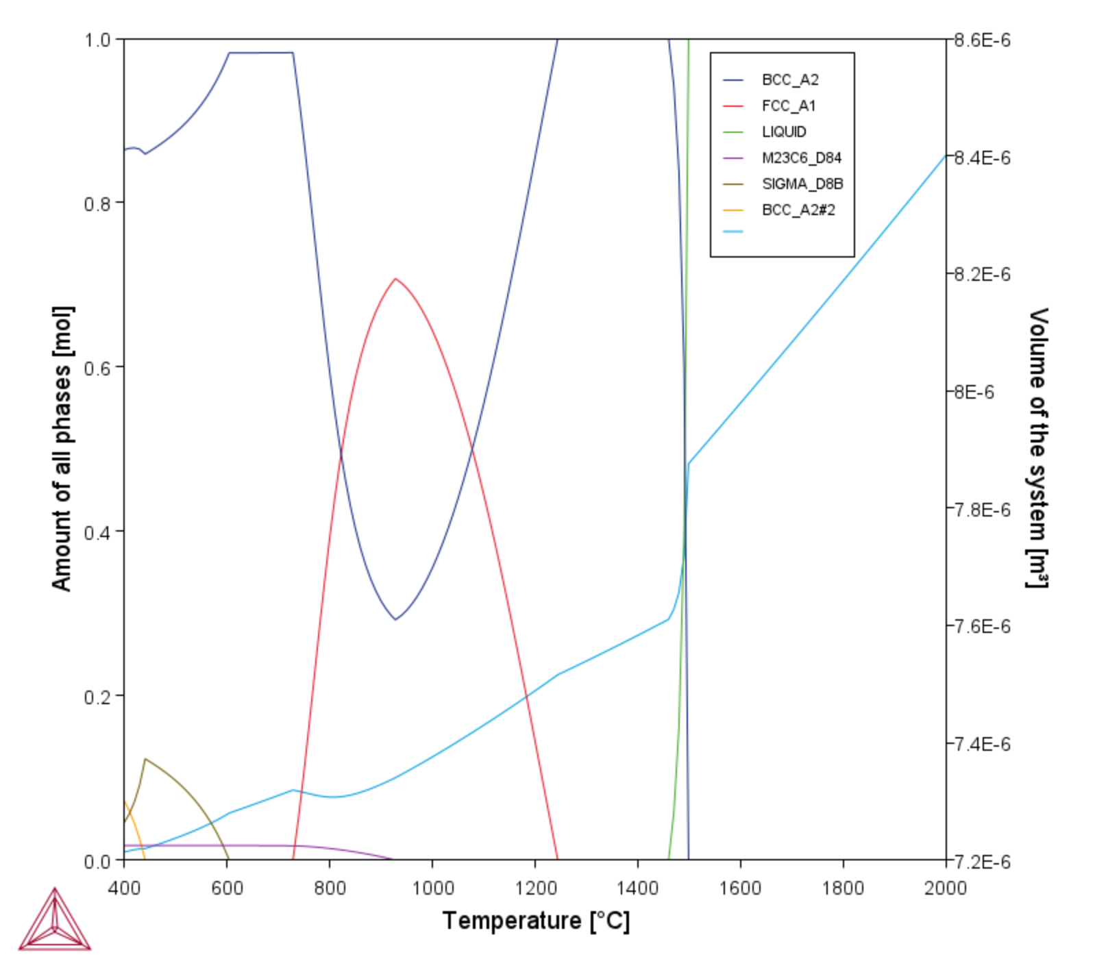
- Click Perform to plot both variables on the selected axis, in this example, the Y-axis.

