Merging Plots into One Diagram
You can merge (or overlay) calculated results for several variables into one diagram. The same X and Y variables are used to compare the third variable (defined in the Plot Renderer as the Z-axis).
You cannot overlay heat map or frequency plots.
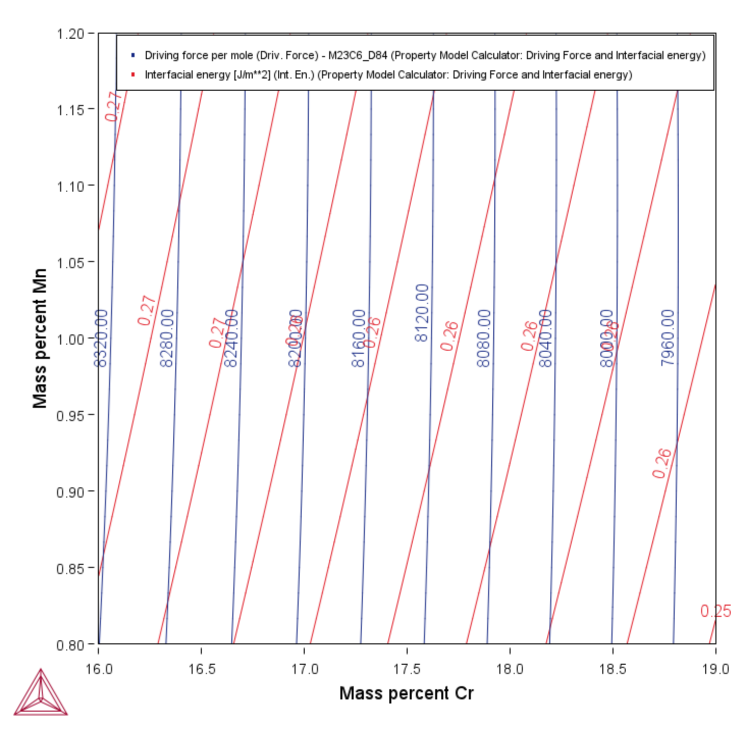
The following uses example PM_G_03: Driving Force and Interfacial Energy to describe the steps to overlay two plots: the driving force and interfacial energy results are combined into one diagram. The X- and Y-axis is the same for both (Mass percent Cr/Mass percent Mn).
In the Plot Renderer settings window, click Show more and Show less to toggle between viewing all or some of the available settings.
- In the Project window right-click the calculator node (e.g. Property Model Calculator) and add a Plot Renderer node from the Create New Successor menu.
- Click the Plot Renderer node.
- In the Configuration window, define the plot. Choose On for the Legend option and Contour as the Plot type.
- Click the
 Add an axis button. A new axes settings section is added underneath.
 - For the Z axis, choose the variable. In this example, Interfacial energy. Select a unit or keep the default.
- Click Perform to plot both on the same diagram.
In this case, a contour plot showing both the driving force and interfacial energy calculation results comparing Mass percent Cr to Mass percent Mn.

