Working with AM Visualizations
The AM Calculator visualization using the Plot Renderer is different from the other Calculators available in Thermo-Calc.
See Plot Types for more information for the Scheil Calculator and Diffusion Calculator, which are also used with the Additive Manufacturing (AM) Module.
How the Project Nodes are Connected to the Configuration and Visualizations Tabs
The following examples use a mix of adding an AM template and example AM_01 to provide an overview of how the nodes in the Project window are connected to the Configuration window settings tabs and to the different levels of tabs in the Visualizations window. Try this yourself either by adding an AM template or open any of the examples and click around to understand how the geometry, heat source calibration (when applicable), and various plots are connected between all the windows.
- In the Project window, the AM Calculator, Diffusion Calculator, and Precipitation Calculator nodes, plus all the associated successor Plot Renderer or Table Renderer nodes, are listed in the Visualizations window on the top level tabs using the same name as the node.
- It is recommended you rename the nodes in the Project window to meaningful names that make it easier to navigate the visualizations.
- In the Visualizations window, a Geometry tab is always associated to the AM Calculator node in the Project window. In addition, when a Heat Source Calibration calculation is chosen on the AM Calculator, there is also a Heat Source Calibration secondary level tab associated to this (at the same level as the Geometry tab).
- An AM Calculator and all its Plot Renderer successors are listed on the top level tab. The secondary level tab has visualizations related to geometry, heat source calibration, and the available plot types (3D Plot, Plot Over Line, Probe Plot, and the plots associated to heat source calibration).
- The Diffusion Calculator and any Plot Renderer or Table Renderer successors are all listed in the Visualizations window on the top level tab. The secondary level tab has visualizations related to the Composition Profile and Thermal Profile.
- The Precipitation Calculator and any Plot Renderer or Table Renderer successors are all listed in the Visualizations window on the top level tab. The secondary level tab has visualizations related to the Thermal Profile.
- The Scheil Calculator is not listed on the top level tab in the Visualizations window, but any Plot Renderer or Table Renderer successor for this Calculator is listed on the top level tab.
- Renaming any node in the Project window also renames the top level tabs in the Visualizations window.
- The second level tabs on the Visualizations window cannot be renamed as these represent the visualization type named by the system e.g. a geometry, plot type (3D Plot, Plot Over Line, Probe Plot, etc.), or a Composition Profile (diffusion simulations) or Thermal Profile (diffusion or precipitation simulations).
- For 2D plots (Plot Over Line 2D Plot, Probe 2D Plot), click the Table View button on the applicable tab in the Visualizations window to convert the values into a table format.
Configuration Window
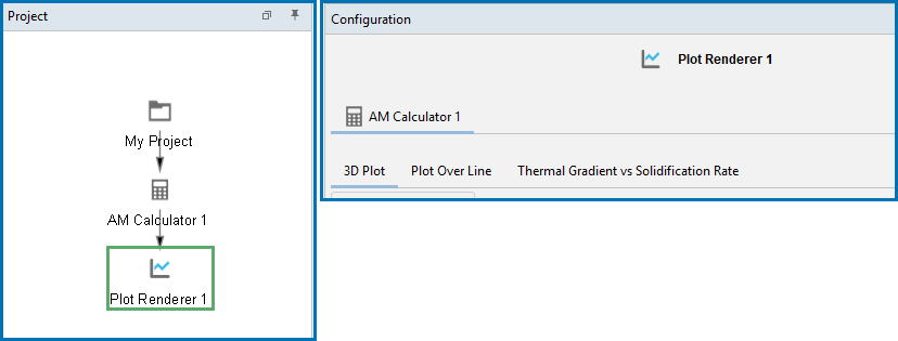
When a Plot Renderer is added to an AM Calculator in the Project window, there are default tabs added to the Configuration window where you can further set up the available plot types. In this example, two tabs, 3D Plot and Plot Over Line, are provided for you to set up these plot types.
Visualizations Window
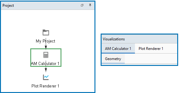
In the Visualizations window, the upper tab level is connected to a second level of tabs that represent the available visualizations. A Geometry tab is always associated to the AM Calculator node. Then for any Plot Renderer node, all of the plotting types such as a 3D Plot, Plot Over Line, Probe, and Thermal Gradient vs Solidification Rate are listed in the secondary tab level.
There is not always something to visualize at the second tab level. Keep an eye on the underlined tabs on both levels, i.e. click the upper level tab and look for the underlined second level tab associated to it and that is what is displayed. Also note that clicking the upper level tabs in the Visualizations window does not change the focus of the node clicked in the Project window, although the opposite is true.
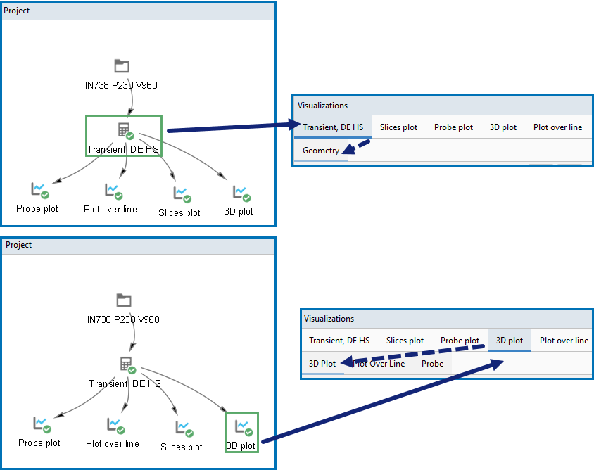
Each node in the Project window is represented across the top set of tabs in the Visualizations window. Then the associated tab on the Visualizations window displays below as a secondary level. For example, in the Project window, if you click the AM Calculator node (in AM_01 it is renamed to Transient, DE HS), then on the Visualizations window the Transient, DE HS tab is highlighted and has a blue underline. On the second tab level, the Geometry tab is also underlined to indicate it is associated to the Transient, DE HS tab. What is actually displayed in the Visualizations window is based on the second tab.
Then for each Plot Renderer added and defined, the secondary tab level is connected to what is visualized. For example, a Plot Renderer is added to the AM Calculator in the Project window. In this case, the node is renamed to 3D plot. When this node is clicked in the Project window, the 3D plot tab is highlighted and underlined in the Visualizations window.
You can also click each of the top level tabs in the Visualizations window at any time to navigate the visualizations, but the node focus in the Project window does not change to match.
Figure 1: When you click a node in the Project window, the associated tab is highlighted and underlined in the Visualizations window. Then the second level of tabs are further underlined to indicate what is associated to the selected top level tab, and this is what actually displays in the Visualizations window.
In the Visualizations window, the top level tab for Plot Renderer is further connected to the 3D Plot and Plot Over Line tabs. You can determine what you are actually viewing in the Visualizations window based on the upper level highlighted and underlined tab and then further by the second level underlined tab.
The following is available for a Steady-state → Heat Source Calibration Calculation Type.
During the set up of the Heat Source Calibration, experiment data is either entered or imported to the AM Calculator. You can then view the Heat Source Calibration on a second level tab in the Visualizations window. This is associated to the AM Calculator.
Then once the experiment data is included and the heat source calibration is performed, you can further create plots on the Plot Renderer to examine the Heat Calibration Parameters and Melt Pool Dimensions.
More details about this are described in a separate topic. See Visualizing Heat Source Calibrations.
Visualizing Batch and Grid Calculations
The following is available for a Steady-state → Batch or Grid Calculation Type.
Results from Steady-state simulations using Batch or Grid calculations contain multiple steady-state results, one for each power and scan speed. The results can be visualized individually using a 3D Plot and Plot Over Line (described above). The combined result from all steady-state simulations can additionally be visualized from the Batch tab (available on the Plot Renderer Configuration window after the Batch calculation), and similarly from the Grid tab after a Grid calculation. On these tabs you choose additional plot types Printability map, Parity plot, and Melt pool vs energy density.
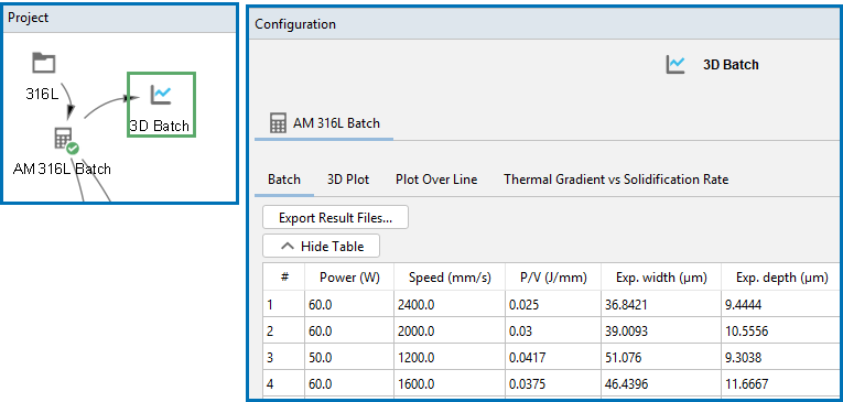
A table of the experimental and calculated values can be viewed when you click to toggle between the Show Table or Hide Table buttons. The table is displayed in the Plot Renderer Configuration window for the relevant Batch or Grid tab.
Figure 2: The simulated and experimental melt pool dimension can also be tabulated for all data using the toggle button to Show Table or Hide Table. This is from example AM_09b.
More details about this are described in separate topics. See Visualizing Batch Calculations in the AM Module and for the various plot settings for a Grid, these are included with the general topic, AM Calculator: Plot Renderer Settings.
There is a video tutorial about the Printability Map on our website and on our YouTube channel. It is also included in the Additive Manufacturing Module YouTube playlist.


