Global Plot Settings: Design the Look and Feel
Make global changes to the various defaults used for the settings.
To open the Options window:
- Windows: Select Tools →
 Options.
 - Mac: Select Thermo-Calc <version> → Preferences or Settings or press <⌘> on the keyboard.
On the Options window you can access the same settings either from the Graphical Mode or Console Mode tabs.
- Click the Graphical Mode → Activities tabs and then click the Plotting node in the tree, or
- Click the Console Mode → Plotting tabs.
The Console Mode and Graphical Mode plot settings are independent of each other once you start making changes to any predefined or custom Themes, or when applying changes to individual plots in either Mode.
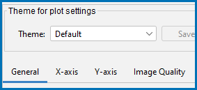
The following global design settings are available for both Graphical Mode and Console Mode from the General tab or as indicated for the X-axis, Y-axis, and Image Quality tabs.
On the General tab (Title format and Label format) and the X-axis and Y-axis tabs (Axis label format) select Plain text (the default) or LaTeX formatted text.
For LaTeX formatted text you can use the LaTeX math text to enter text. See ADD_LABEL_TEXT and Plot Labels for more details.
Select the Show legend checkbox to include a legend on the plot. By default no legend is displayed.
On the X-axis and Y-axis tabs, choose or enter a Tick mark length (6 is the default).
The defaults are to have the Tick marks outside the chart and to Show tick labels. Click to clear the checkboxes as required.
For the Legend phase caption style, choose None, All, Constitution description, or Ordering description.
By default the Retain labels checkbox is selected. Plot labels are kept (retained) when plots are updated. It can be applied globally or locally to individual plots.
Click to select the Show header checkbox to display the basic details about the plot along the top. This includes the date and time the plot is generated, the database used, and the properties.
This is related to the Light and Dark look and feel modes set under Tools → Options then on the General tab. See Global General Settings.
This section is about Global changes to the default output for all plots for any future project files. Global settings take effect for new project files and/or new plots added to existing projects. That is, the default setting only affects how the plots start out initially. Once a plot is created the settings are locked to the mode and can only be changed locally.
You can locally change an existing plot in a project. See Changing the Plot Properties for details.
Select a Color switching option: Switch automatically between Light mode and Dark mode (the default), Always use Light mode colors, or Always use Dark mode colors.
Tie lines and invariant lines are the same color for both Light and Dark modes, i.e. these colors do not change.
Use the Color switching option to override the look and feel settings that may not be optimal. For example, when preparing a plot for publication, the Dark mode plot or line colors may not work well or do not follow a journal's guidelines. In other words, you can view and export the plot with Light mode color settings even though the interface is using Dark mode, and vice versa.
On the General tab (Title, Legend, Label, Header, and on the X-axis and Y-axis tabs (Axis Label, Tick Label, click Modify to edit the Font Name, Style, Size, and Color.
To change various background color attributes, click Modify to choose a color or enter a specific color.
Click to select the Show grid checkbox to include a grid on the plot. By default no grid is displayed.
Tielines are only applicable to phase diagrams.
Choose an integer value ranging from 0 to 99.
For the for plot line colors, choose a Color option from the list: Legacy, Printer friendly, JFree chart, Pastel, Medium dark, Bright dark, Vivid, or Earth.
This option is also available for specific plot lines. To change the color of an individual plot line double-click it in the Visualizations window and use the color palette to define it or enter a specific color.
Choose a plot Border width between 1 (thin, the default) and 10 (thick).
For the plot line width, choose a Line width from the list. These options are also available for specific plot lines. To change an individual plot line width double-click it in the Visualizations window.
Click to select the Show anchor checkbox. By default, an anchor between the label and the plot point is displayed.
From the Data points marker list, scroll to select a symbol to use to display the data points on plot lines. This option is also available for specific plot lines. To show data points on an individual plot line double-click it in the Visualizations window and select a symbol from the Marker list.
Choose the Data points marker size between 1 (small) and 10 (large). The default is 3.
Choose the Number of decimals to display in the plot. The default is 2.
Choose the Numeric format to display in the plot Auto, Decimal, or Scientific.
Click the Image Quality tab to access the settings below.
Choose a Default file format: Portable Network Graphics .png (the default), Graphical Interchange Format .gif, Enhanced Windows Metafile .emf, Portable Document Format .pdf, PostScript .ps, Scalable Vector Graphics .svg, or Joint Photographic Experts Group .jpg.
The following settings are only available for .png and .jpg file formats.
To change the resolution of a *.png or *.jpg image, click to clear the Use default resolution checkbox. Then enter a numerical value in the Dots per inch (DPI) field. For .*jpg files, you can also use the slider to choose a number between 0 and 1 for the JPG quality. The default is 0.9. The lower the number, the smaller the file.


