Plot Type: Parallel Coordinates
The Plot Renderer is a dynamic activity node with options such as being able to choose from a variety of Plot types based on the Calculator and Calculation Type selected.
Calculation Types in Graphical Mode
See Plot Types detailing availability By Calculator, By Plot Type, or By Calculation Type.
The Parallel coordinates plot type is available when using the Property Model Calculator with a Grid, Batch, or Uncertainty Calculation Type.
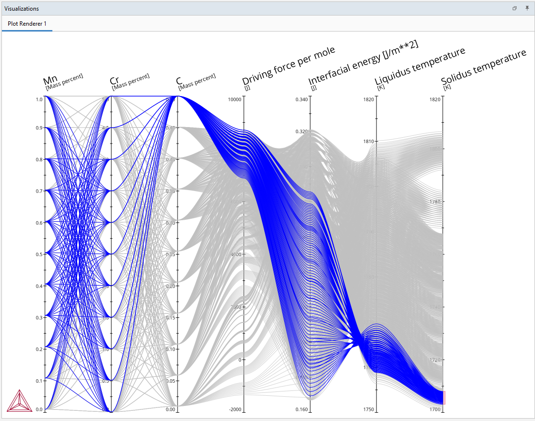
The Parallel coordinates plot is useful when interpreting multidimensional data and to compare how different parameters affect each other. This is especially useful in materials design after performing a batch or uncertainty set of evaluations when multiple inputs are varied at the same time and multiple model outputs are given as a result.
It is recommended that you detach the Visualizations window and then drag the edges of it to fully display (i.e. stretch out) the results for this detailed plot.
For this plot type, there are some differences compared to other plots as to what can be done on the Visualizations window and the Plot Renderer Configuration window.
- Visualizations window: After a plot is generated, the options available when you right-click are slightly different. You can choose to Select/Deselect a line (to display additional information), and to Save As and Copy plot images. See Visualization Window Plot Options.
Other options such as Plot Themes and plot formatting options are not available.
- Plot Renderer Configuration window: You can select the Filter checkbox and then filter one or more quantities. For some parameterized plot quantities, there is a filter list made available after the first time the quantity is plotted. See Plot Renderer Configuration Window Options.
To access this plot type on the Plot Renderer for a Grid calculation, at least three quantities under Grid Definitions must be selected on the Property Model Calculator.
Tips to Interpret the Plot Data
- When most lines between two parallel axes are somewhat parallel to each other, there is a positive relationship between these two dimensions.
- When lines cross in a kind of superposition of X-shapes, that is a negative relationship.
- When lines cross randomly it means that there is no particular relationship.
Overlay Compositions on the Same Plot
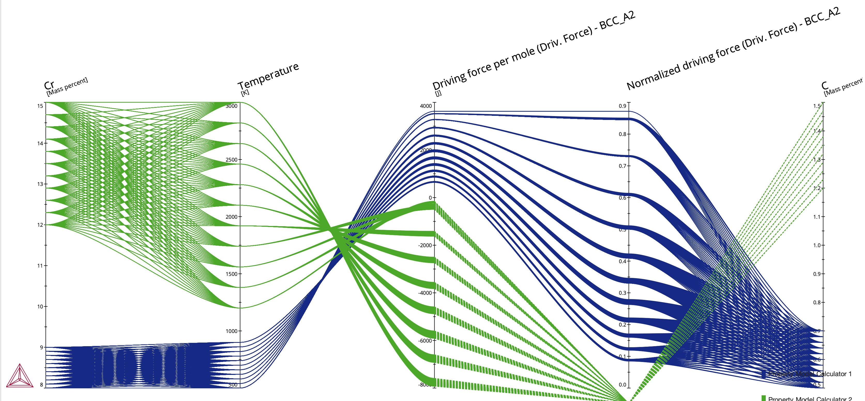
For this plot, you can combine and overlay calculated results from two or more Property Model Calculators and show it on one plot in the Visualizations window, even if they have been set up for different grids. This is available for a Grid calculation and when you are including three or more axis quantities for two Property Model Calculators. Each composition has its own line and it is color coded so you can identify which Property Model Calculator a given result is from.
Figure 2: Parallel coordinates plot with two sets of composition data overlaid and color coded for each Property Model Calculator.
Visualization Window Plot Options
Once the plot is generated in the Visualizations window, you can right-click and choose one of these options:
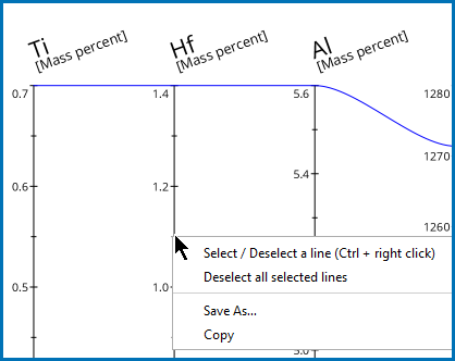
- Select/Deselect a line (or Ctrl + right-click). For this option, you must right-click directly on an axis line to view the details and highlight the relevant information.
- Save As to save the plot (in its current state) as a jpg, png, or gif file.
- Copy to copy the plot (in its current state) to a clipboard. Then you can paste it into any supported application. The pasted image defaults to a png format.
For both Save As and Copy actions, the image is saved in the current state that the both the plot and Visualizations window is in, i.e. if you have selected one or more lines to display information, then this is what is included in the saved file. It is also saved based on the current size of the Visualizations window, i.e. to ensure that the entire plot is saved, you may need to expand the window to the full view you want to capture. Sometimes it is also useful to detach the window and drag it to full size before saving the image.
There are examples using this plot type available:
A Nickel Model Library example PM_Ni_04: Strain Age Cracking (SAC).
A Steel Model Library example PM_Fe_11: Steel Design Using the Parallel Coordinates Plot.
Select and Deselect Lines
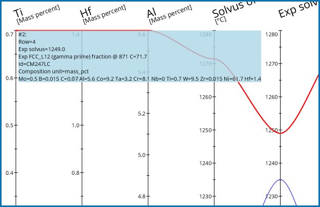
In the Visualizations window, you can highlight and display details about any plot axis, which is useful particularly with complex plots.
You must directly right-click the axis line to turn it on (select) or off (deselect); it does not work to just right-click anywhere in the Visualizations window for this action.
To toggle the Select/Deselect a line option on (select a line) and off (deselect a line), hover over an axis line then:
To deselect all lines, either do this one at a time or when several lines are selected, you can right-click to choose Deselect all selected lines.
Figure 3: Choosing to display specific axes lines and the associated information on the Visualizations window for a Parallel coordinates plot type.
Save As
- Once the plot is generated in the Visualizations window, right-click anywhere in the window and choose Save As.
- In the Save window:
- Navigate to where you want to save the plot.
- Enter a File Name.
- From the Files of Type list choose png (the default), jpg, or gif.
- When you are ready, click Save.
Copy
- Once the plot is generated in the Visualizations window, right-click anywhere in the window and choose Copy.
- Navigate to where you want to paste the image (i.e. Word, Slack, email, and so forth) and Ctrl + V to paste it. The pasted image defaults to a png format.
Plot Renderer Configuration Window Options
Filter Quantities
Use the Filter checkbox on a Plot Renderer to add various filters to the Parallel coordinates plot or table and based on the set up of the calculation.
When selected, click the  Add quantity and
  Remove quantity buttons to add filters. For example, enter a Min and Max and choose an axis variable such as Composition Cr and the unit Mass percent to adjust the output in the Visualizations window. Click Perform each time you add or remove a filter for the results to update.
Filter Parameterized Quantities
For a Parallel coordinates Plot type, and only for parameterized result quantities, you can choose to show all or one specific quantity on the plot. By default, and when you first choose these types of results quantities, All quantities are plotted in the Visualizations window output after performing the first calculation. Once the secondary list is available you can then choose to plot only one of the quantities at a time. The availability of the filter list is dependent on the result of the initial calculation.
This filter option does NOT use the Filter checkbox. The filter list displays AFTER clicking Perform for the chosen quantity. Once the quantity is plotted you can choose to filter by the individual quantities included in the list. Initially, All quantities are plotted.
- From the Axis variable list, choose a quantity. For example, for the Martensitic Steel Strength Property Model, you can choose Precipitate fraction (Tempering).
- Continue adding and selecting any quantity you want to include in the Parallel coordinates plot.
- Click Perform. Go to the Visualizations window to view your results.
- If the type of quantity you selected has additional filtering options, on the Plot Renderer Configuration window, next to the original quantity chosen, there is now a secondary filter list available. It defaults to include All quantities or from the list you can choose to plot a specific quantity. When you use this list to filter, it includes All or one quantity, i.e. you cannot choose more than one option.
- Click Perform each time you change the selection in order to regenerate the plot.
To plot more than one specific parameterized quantity at a time, click the  Add quantity button, select the same quantity again (e.g. Precipitate fraction (Tempering)) and then after performing the calculation, from the secondary filter list choose the second quantity you want to include. That is, add the parameterized quantity twice, perform to access the secondary filter list, then individually choose the two quantities you want to plot. Remember to click Perform to regenerate the plot.


