Plot Type: Cross Plot and Statistical
The Plot Renderer is a dynamic activity node with options such as being able to choose from a variety of Plot types based on the Calculator and Calculation Type selected.
Calculation Types in Graphical Mode
See Plot Types detailing availability By Calculator, By Plot Type, or By Calculation Type.
Statistical (with a Histogram or Probability Axis Type)
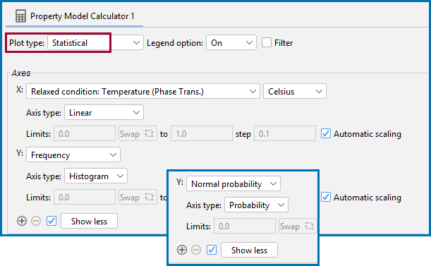
Use a Statistical Plot type to select Frequency or Normal probability as the Axis variable. The Axis type is then set to Histogram or Probability, respectively.
The following uses a General Property Model example: PM_G_01: Phase Transition.
The two combination options, Frequency → Histogram or Normal probability → Probability, selected with Statistical on a Plot Renderer as a successor to a Property Model Calculator.
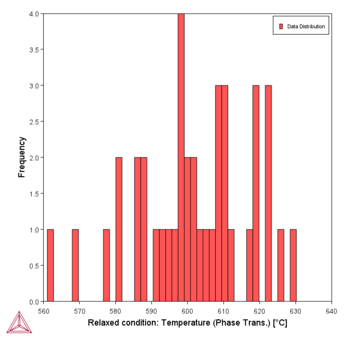
A Statistical Plot type, with the Frequency Axis variable and Histogram Axis type selected.
A Statistical Plot type, with the Normal probability Axis variable and Probability Axis type selected.
Cross Plot (Parity Plot)
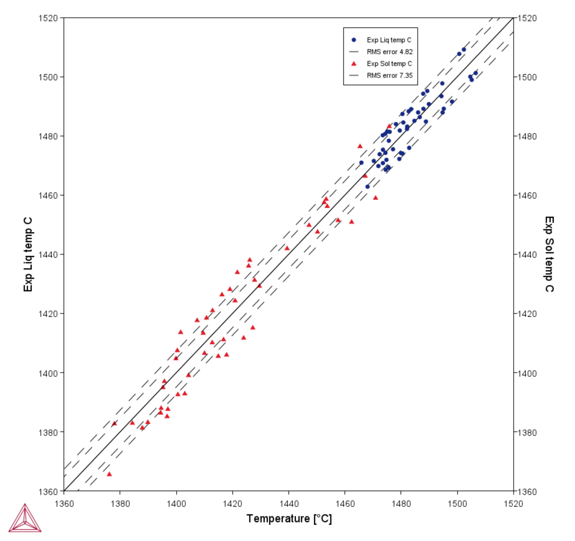
Use Cross plot to plot the experimental data from a Batch calculation with the calculated result, e.g. you might be looking at liquidus temperature and now can plot both to compare the experimental data against the Thermo-Calc calculated results. You choose the experimental data value (which is read from the data file) as an X- or Y-axis variable and then the calculated result as the other X- or Y-axis variable. This is also known as a parity plot.
The following uses a General Property Model example: PM_G_12: Solidus and Liquidus Batch Calculation.
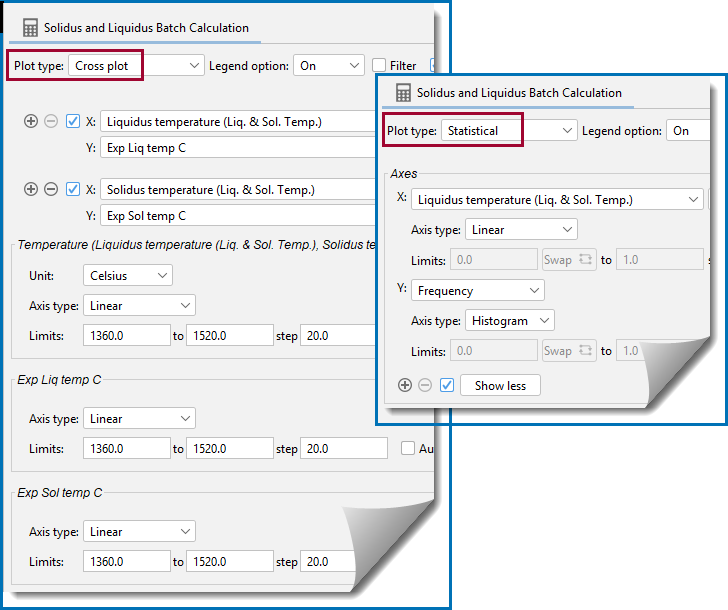
For a Batch calculation, and when the data file contains experimental (Exp) data, you can use Cross plot on a Plot Renderer to compare it to the simulated results.
A comparison of experimental liquidus and solidus data using a Cross plot with a Batch calculation. A root mean square (RMS) setting shows the distribution of the data points.
There is a blog post related to ICME Workflows that provides an additional example about the use of cross plots.
Another example showing the use of cross plots is PM_G_03: Driving Force and Interfacial Energy, which also has a video to accompany it.
