PM_G_01: Phase Transition
The example uses the Property Model Calculator to predict the transition temperature to the unwanted brittle sigma phase. The example shows how the temperature is influenced by changes to a steel alloy’s composition using the Uncertainty Calculation Type and then you can choose to use either a Histogram (frequency diagram) or Probability plot after choosing the Statistical Plot type on the Plot Renderer.
Phase Transition Property Model Settings
- Folder: Property Models → General
- File name: PM_G_01_Phase_Transition.tcu
Visualizations
This example is included as a Property Model tutorial on our website and as part of the Property Model Calculator playlist on our YouTube channel.
Open the example project file to review the node setup on the Project window and the associated settings on the Configuration window for each node. For some types of projects, you can also adjust settings on the Plot Renderer Configuration window to preview results before performing the simulation. Click Perform Tree to generate plots and tables to see the results on the Visualizations window.
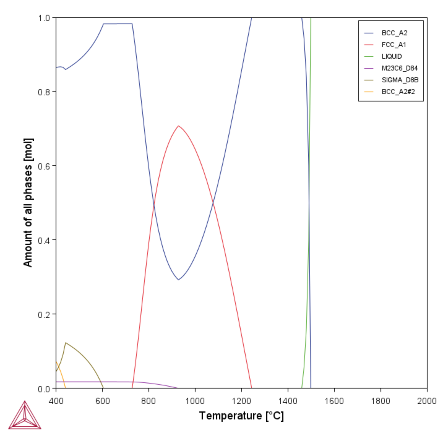
Figure 1: A property diagram as a result of using the Equilibrium Calculator with a One Axis calculation to determine a good starting temperature of the SIGMA phase.
Once you set up the Property Model Calculator, but before running a Grid calculation, it is recommended you run a Single calculation to make sure the calculation is valid.
- If the subprocess worked, it displays in the Event Log. The Event Log also has the result
Relaxed condition, referring to the variable, which in this case is temperature. - If the calculation did not work,
NaN(not a number) displays instead. Check your configuration set up and run the calculation again before moving on to the more complicated calculation.
About the Uncertainty Calculations
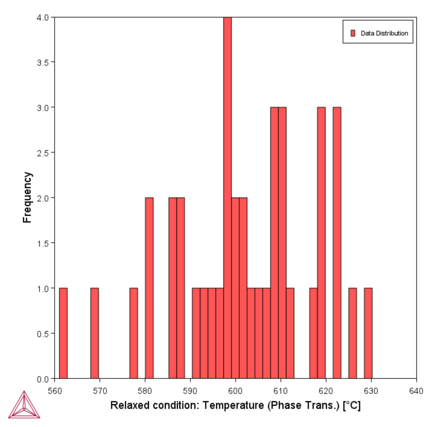
Figure 2: Using the Property Model Calculator with the Phase Transition Model to plot a histogram showing how the transition temperature of sigma varies when you vary the composition. The plot changes each time you run the calculation because it is taking a random sampling from the composition range set.
The X-axis is labeled the Relaxed Condition: Temperature (Phase Trans.), which you can see on the Plot Renderer 1 Configuration window. The Y-axis shows the Frequency, which is the number of samples out of 40 where the composition transitions at each temperature. You can see that the transitions occur more frequently near the 600 °C starting point and less frequently at the edges.
Since only one variable can serve as a Relaxed condition per calculation, the quantity that is not relaxed has a NaN result in its corresponding result quantity. The Temperature result quantity inherits the unit set in the conditions while the Composition result quantity inherits the normalization (mole or mass) but always returns a fraction.

