T_20: Ternary Diagram with Clockwise Plot Axes
This Ternary Calculator example for a Cr-Fe-Ni system shows how to use different plot axis combinations on the Plot Renderer representing clockwise and counterclockwise axes. This example uses the FEDEMO database and is available to all users.
A ternary phase diagram is fully defined by the elements in the corners of the diagram. See Figure 1 for the Cr-Fe-Ni 1000 K isothermal section when plotted as a ternary diagram. To plot this diagram in Thermo-Calc you define the X- and Y-axes instead of the corner elements.
Define the X- and Y- Plot Axes
The same diagram can therefore be defined with different combinations of the plot axes. In this example, there is Cr in the bottom left corner and Fe in the lower right corner. Then you can define the X-axis by Fe increasing from 0 to 100 (these numbers are entered in the Limits fields). It is also possible to define the X-axis by decreasing Cr from 100 to 0. The main reason for defining a decreasing plot axis in Thermo-Calc is when comparing with experimental diagrams that can be visualized in this way.
To define a decreasing plot axis, on the Plot Renderer, click to deselect the Automatic scaling checkbox. Then either change the limits as described above by entering 100.0 and 0.0 in the fields, or click the Swap button to swap the lower (0.0) and upper (100.0) limits.

The Flexible Mode plot type is used in this example as it allows you to individually work with the axes.
Visualizations
Many of our Graphical Mode examples have video tutorials, which you can access in a variety of ways. When in Thermo‑Calc, from the menu select Help → Video Tutorials, or from the main My Project window, click Video Tutorials. Alternately, you can go to the website or our YouTube channel.
Open the example project file to review the node setup on the Project window and the associated settings on the Configuration window for each node. For some types of projects, you can also adjust settings on the Plot Renderer Configuration window to preview results before performing the simulation. Click Perform Tree to generate plots and tables to see the results on the Visualizations window.
- Folder: Thermo‑Calc
- File name: T_20_Ternary_Cr-Fe-Ni_Clockwise_Axes.tcu
In the installed example the Plot Renderer node is renamed to Counterclockwise x:+Fe y:-Cr. As above, the settings are completed on the Configuration window to plot the Composition of Fe on the X-axis and Cr decreasing on the Y-axis. Click Perform to display the result of Figure 1.
You can continue on the Plot Renderer to plot different combinations of axes variables in order to represent clockwise and counterclockwise plot axes.
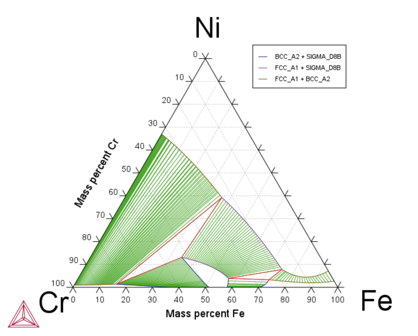
Figure 1: Counterclockwise x:+Fe y:-Cr. Increasing Mass percent Fe (X-axis). Decreasing Mass percent Cr (Y-axis).
Then for the other plot examples, the settings on each Plot Renderer Configuration window (for renamed nodes Clockwise x:-Cr y:+Ni and Counterclockwise x:+Fe y:+Ni) are also changed to show the different combinations of plot axes.
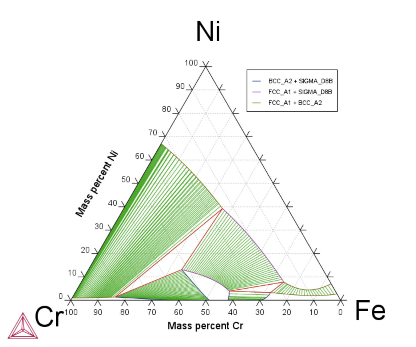
Figure 2: Clockwise x:-Cr y:+Ni: Decreasing Mass percent Cr (X-axis). Increasing Mass percent Ni (Y-axis).
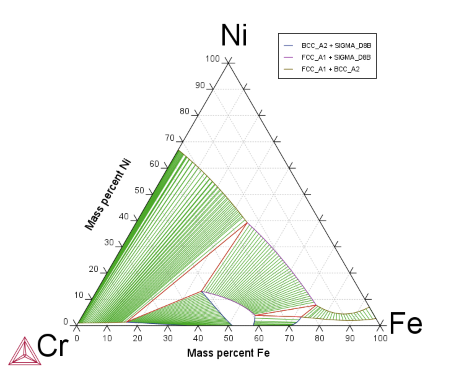
Figure 3: Counterclockwise x:+Fe y:+Ni: Increasing Mass percent Fe (X-axis). Increasing Mass percent Ni (Y-axis).